

Fiit Defining app MVP
Creating the UK’s top rated interactive fitness app. Alongside a talented, cross-functional team, I led the product experience design of the app MVP and many of the key post-MVP features. It was an incredible experience to help start a new company.
Year
2017-2018
Team
UX Designer (me)
Co-founders x3
Head of product
Engineers (iOS, JS)
Brand agency
Visual / brand designer
Fitness experts
Marketing manager
Results
4.9* rated iOS app
App of the day in iOS app store
4.5 avg class ratings
1m classes done 1 year after launch


App Vision
We envisaged a platform that brings together engaging boutique studio style HIIT fitness classes with the motivation of digital interactivity.
At the time most at-home workouts were done using YouTube or Instagram, but we believed this was not engaging enough.
2. Research and insights
I carried out several rounds of user interviews and analysed market research to identify primary and secondary target user personas and their needs. Features they shared: health conscious, tech enabled, time poor and struggle to stick with a fitness routine.
The ‘career parent’ persona became our main customer for a while until Fiit changed direction into a more performance-driven functional fitness space.
$558M
wasted globally on annual gym fees
80%
of people say they don’t do enough exercise
150k
fitness apps, 1% usage after 90 days

3. Competitor reviews
Each of the areas of the app needed to be defined from scratch. I started with class discovery and navigation. I reviewed various competitor models and created quick wireframes to user test.

3. Sketching flows
Working very closely with the founders, product manager, and tech lead I mapped out the core MVP experience. I fed insights from users and competitor reviews into this process. This laid the foundation for the app architecture for years to come.

I also defined a holistic customer experience map to help capture all app, web and other system requirements and identify key user touch points.

4. Lo-fi user flows
Using sketches and CX mapping, I created screen flows for the key areas of the app.

5. Wireframing and user testing
I created numerous wireframes of various levels of fidelity to nail down the information architecture, key screen flows and components. No design system existed yet.


6. In-class UI
The in-class experience was the core of the app’s proposition. Together with the fitness team I went through numerous iterations to define the interactive and motivational in-class experience for Fiit’s HIIT-style classes.
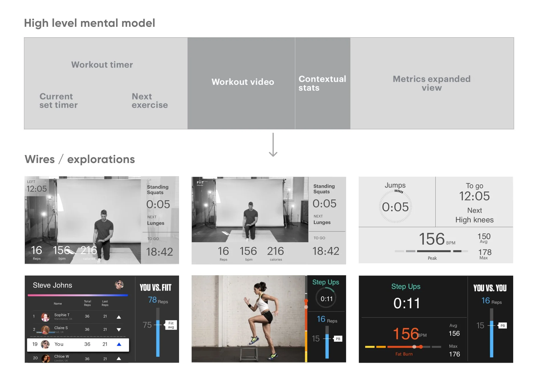
I reviewed various competitor fitness apps and explored designs for in-class motivation, e.g. hitting a particular heart rate zone.
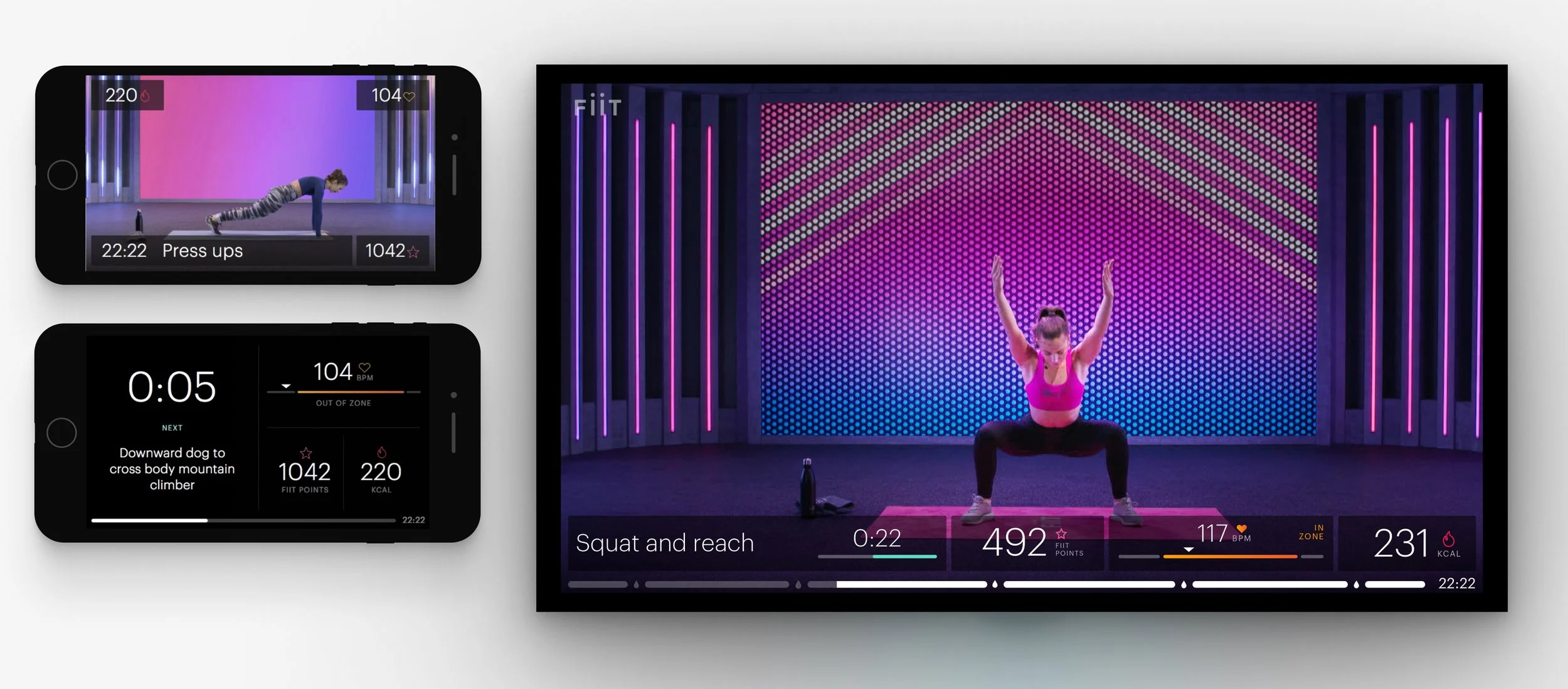
The in-class views that resulted (Fiit in 2018-2019). Since then a lot of enhancements have been made (e.g. adding leaderboards, shout-outs) but the foundations remain.
6. App UI
I worked closely with a brand designer to make sure all key screens, flows, interactions and edge cases were considered in visual design. The brand agency set the initial ‘look and feel’ that we translated into UI components.


7. Results
4.9*
app rating in the iOS store (Android launched a year later and reached 4.7*)
x 7
In weekly active users In the first year after launch
4.5
(out of 5) average class ratings on the iOS app within 3 months after launch