
Epsy Health Blog
Responsive blog design for the Epsy Health website (Webflow)
When
Nov 2022 - Jan 2023
Team
Product Designer (me)
Marketing manager
Webflow developer contractor (managed by me)
Results
New level of blog categories added
Reduced bounced rates on article pages and increased engagement time
Challenge
The health blog on Epsy’s website required an update to accommodate an additional level of categories within the content structure and improve usability. The redesign, along with SEO and site speed improvements, were needed to help improve bounce rates and increase the time users spent engaging with the blog pages.
The site was built by an external developer on the Webflow CMS including modifications using custom code.
The first step I took was understanding the new Information Architecture and worked with marketing to define new blog sub-categories that users have expressed interest in.

IA sitemap with an updated content structure for the blog. The green boxes demonstrate the new level of categories to be added.
2. Discovery
I conducted a competitive review and identified multiple opportunities to improve our blog pages. I also reviewed google analytics data, and decided to put emphasis on the mobile experience as 75% of visits were from mobile devices.

3. Design iterations
I started by understanding the structure of the pages, their behaviour and responsiveness. I created designs using a grid to ensure the content blocks adapted fluidly when viewing the pages on smaller screens. I worked with the developer to implement the grid within the constraints of the CMS.

Over several iterations I worked on designs and flows, evolving and improving components and styles. Regularly I presented designs to the design team and marketing to get feedback.

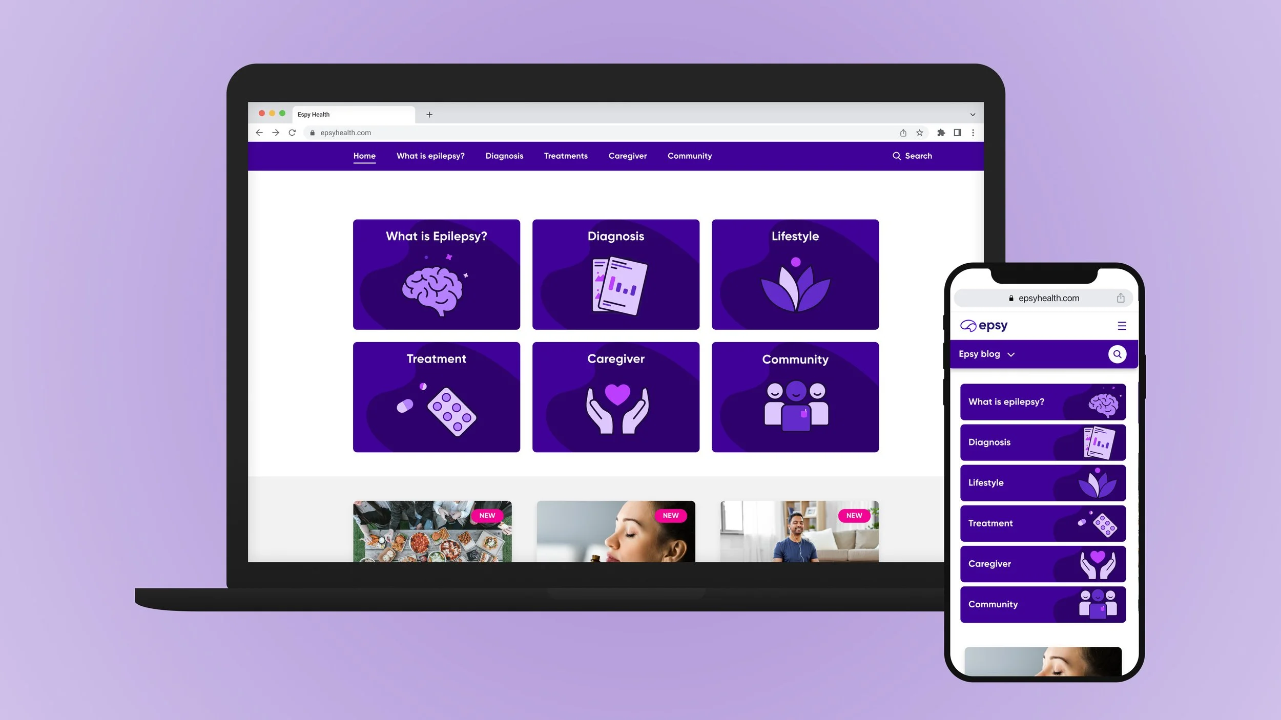
Mobile designs for key blog pages

Desktop designs of key blog pages

I created a set of illustrations for the main category tiles, keeping in line with the Epsy brand style, and turned them into reusable components.
4. Design system
As part of designing the screens I created a set of components that the new blog would include, which formed the foundation of Epsy’s new website design system (which was separate from the app design system).

5. Prototyping navigation
Adding an extra level of navigation on responsive mobile was tricky because the existing menu already had sub-sections and a full redesign was out of scope. I utilized the Epsy Purple brand colour to make the secondary level of navigation stand out. The label in the sticky navigation bar helps user see where they are in the new site structure. They also have access to the primary level nav in case they wish to move away from the blog.
Search was an important feature as part of the redesign, so I chose to show it prominently in the navigation header.
The Figma prototypes helped me communicate with developers and designer and get feedback quickly. (The prototype below is focused on the secondary navigation interactions only (the purple bar). In case there is an issue playing the prototype, it can also be viewed in Figma preview here.)
6. Development and QA
Working with an external developer presented a few challenges, especially when we needed to work around constraints of Webflow CMS. I worked closely with the developer using various tools (e.g. Loom, Figma, Zoom) to resolve issues asynchronously where possible. I also conducted several rounds of QA to make sure the experience was as seamless as possible.

Developer regularly sent pre-recorded videos via Loom for me to watch and respond with design updates or clarifications
7. Results and next steps
The blog launched in January 2023 and allowed Epsy to introduce more content across more categories. Several months after launch the key results were:
New level of blog categories allowed for more articles to be promoted on social, which resulted in increased traffic (around 10-15%) to some of the categories that were less viewed before.
Reduced bounced rates on some article pages were reduced by 20-40%
Time spent on article pages went up by varying amounts (depended a lot on content)
New Epsy Health blog is available here
The next phase will be to improve the main website navigation to make it more integrated with the new blog structures. I’ve proposed the next version of navigation improvements.
